From Geocities to Design Systems: Lessons in Rolling With It
A nostalgic, funny look at the eras of web design—from dancing hamsters and <blink> tags to parallax and Material Design. See how every trend, disaster, and “next big thing” shaped modern UX and what it taught us about adaptability.

At the ripe old age of “40+,” I’m officially a fossil in the fast-moving world of web design. I’ve survived hamster GIFs, table-based layouts, the float wars, and the scrolljacking carnival. I’ve been through enough design eras to know one thing: nothing sticks around forever. Consider this my mixtape of UI/UX eras I’ve lived through — each one ridiculous, brilliant, or both.
The Geocities Era (a.k.a. The Age of Hamsters & Hit Counters)
That’s right, buckle up, babies — it’s going to be a long ride. In ye olden times (late 1900s), I was blasting out HTML straight from an online text editor. Framesets everywhere. Responsive design wasn’t a twinkle in anyone’s eye yet. Tables and frames were the duct tape of the web.
Backgrounds tiled endlessly in both directions. Got some animated hamsters? Throw them in! Sparkles followed your mouse. MIDI files auto-played. There was definitely a dancing baby GIF somewhere in there. Guestbooks! Marquee text! Hit counters at the bottom of every page to prove people visited your site (even if they didn’t). “Under construction” GIFs were the badge of honor.
Back then, your “UI/UX” skillset was defined entirely by how well you could slice up a Photoshop file. Inline styles made your HTML tags run longer than the Dead Sea Scrolls. And somehow, we loved it.
The Flash Era (a.k.a. Skip Intro: The Movie)
If Geocities was duct tape, Flash was fireworks. Suddenly the web had splash pages, animated intros, and interactive experiments that felt like magic at the time. You didn’t just visit a website — you endured a loading bar, a cinematic sequence, and then clicked the tiny “Skip Intro” button to actually get to content.
ActionScript made you feel like a genius… until nothing worked in Internet Explorer. Whole cultural landmarks like Homestar Runner and Strong Bad Emails were born out of this. For a while, Flash made the web feel alive. Then the iPhone came along without Flash support, and it all went the way of Macromedia.
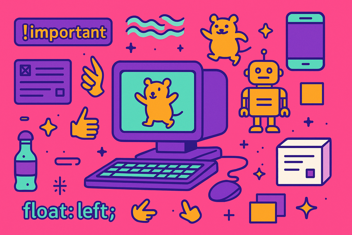
!Important Times (a.k.a. The Float Wars)
The first time I met CSS, I didn’t know whether to be impressed or offended. After years of jamming everything into <font> tags, suddenly there was this… stylesheet thing? It felt like witchcraft.
But CSS also brought pain: specificity wars, floats that refused to behave, and the eternal nightmare that was IE6 compatibility. (“Does it work? Okay, now break it for IE6.”) CSS was supposed to make styling simpler, right? Change it in one place and — boom — it’s fixed everywhere. Well… not exactly. Not when your team keeps restyling the same button over and over again with slightly different class names.
The 960 Grid Era (a.k.a. The Pixel Prison)
Finally — structure! 960 stood for pixels, and we all thought that was a perfectly large enough number for any website. Columns, gutters, neat little boxes. Rigid and inflexible, sure, but at least we’d kicked the nested tables habit.
I can still remember the joy of using Firebug in Firefox to inspect a layout. Explaining to clients why their site had to be exactly 960 pixels wide was a rite of passage. It was a grid, not a suggestion. It still exists if you want to check it out.
The Bootstrap Era (a.k.a. The Great Uniformity)
Enter Bootstrap, and suddenly the internet wore the same outfit to every party. Jumbotrons! Rounded buttons! Grids that actually flexed. Grids flexing inside of grids!
We all abused the Jumbotron class at least once, just to see how massive it could get. And who didn’t recognize that default blue button? Entire corporate intranets were built on it.
Eventually, though, Bootstrap felt dated. Flexbox came in, then CSS Grid, and the idea of rigid “columns and gutters” started to fade. For me, it was another moment of realizing how quickly the tools change, and how much of design is about learning to let go of what once felt like the only way forward.
The Parallax Era (a.k.a. The Scrolljacking Carnival)
Ah yes, the era of “anything is possible!” Designers everywhere lost. their. minds. with layers scrolling at different speeds. Nike Better World was the parallax demo site melted peoples faces. Scrolljacking became the hot trend — and the quickest way to enrage users.
Websites became amusement parks — whimsical, chaotic, occasionally nauseating. And of course, this was also the era when infinite scroll felt like the answer to everything. Spoiler: sometimes you just need a footer.
The Gestures Everywhere Era (a.k.a. The Swipe Apocalypse)
As smartphones took over, gestures became the new frontier. Swipe it! Flip it! Shake it! Hover states weren’t enough anymore — we wanted card flips, keyframes, endless animations. And of course, the hamburger menu showed up on every single site, even desktops.
This was the time when clients begged for apps when they really just needed responsive sites. And who can forget designing tap targets for thumbs while secretly testing everything with a mouse?
The Mobile-First Era (a.k.a. The Thumb-First Crusade)
Right alongside gestures came the rallying cry: “mobile first.” Everything needed to scale down, and suddenly we were designing for thumbs before we were designing for clicks. For a while, this felt revolutionary — forcing us to simplify, prioritize, and think small.
The “Actually, Mobile-First Is Stupid Too” Era (a.k.a. Desktop Isn’t Actually Dead)
But of course, that didn’t last. We quickly realized that designing exclusively for mobile often left desktop users with hollow, stretched-out experiences. The pendulum swung back toward balance. It wasn’t “mobile first” or “desktop first” anymore — it was learning to design responsibly for context.
The Micro-Interactions & Delight Era (a.k.a. The Button Wiggle Renaissance)
After the chaos of gestures and the “mobile first or bust” debates, we collectively hit the brakes. We discovered restraint. Instead of big flashy swipes and flips, we focused on the tiny details.
Facebook was experimenting with animated “Like” buttons. Hover.css libraries promised 50 different ways to make your button bounce. Even loading spinners became design elements in themselves. Delight was no longer about spectacle — it was about those subtle little flourishes that made an interface feel alive. They were so beautiful they made users well up with tears.
The Google Material Design Era (a.k.a. The Paper Kingdom)
This was the dawning of the “design system.” Suddenly we had a shared language, consistency, and guidelines that actually made sense. Shadows had rules! Typography was codified! We felt like grown-ups.
Everything became a card. Explaining elevation and dp units to developers was suddenly part of the job. And don’t even get me started on the endless Roboto vs. Open Sans wars.
The Rebellion & Experimental Era (a.k.a. no more shadows!)
Of course, then we rebelled. Material wasn’t everything. Designers wanted freedom again — shades beyond Google Blue, shadows beyond the spec. We wanted our craft back, not just to be assembly workers in the church of Material.
This was also my experimental phase. I’d already lived through skeuomorphism (remember iCal’s stitched leather calendar?), the sudden pivot to flat design (icons so flat you couldn’t tell what they did anymore), and the brief but glossy neumorphism moment (soft, pillowy buttons that looked amazing on Dribbble but failed every accessibility test).
Material gave us rules, but experimenting outside those boundaries reminded me that design trends aren’t commandments — they’re just eras.
The “MUI Framework” Era (a.k.a. The Clone Army Years)
And then… screw the rebellion. Every new project just pre-installed MUI. Suddenly every component came pre-baked. It was a system, not just “CSS in a box,” but still: why must my primary button always match my header bar? Where’s the freedom, man? I don’t always want my design to look like a clone army. It literally looks like the clone army.
Developers would shrug: “Well, it comes with a theme.” And I’d sigh, knowing full well we’d spend the next sprint overriding it all anyway.
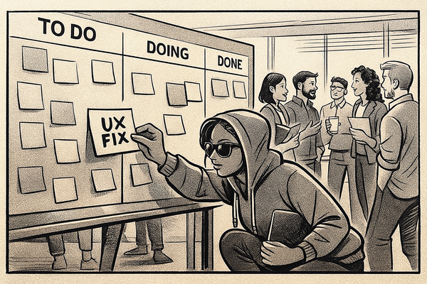
What’s Next?
I’ve been through a lot of eras — hamsters, hit counters, Flash intros, grid wars, swipe apocalypses, arguing the merits of hamburger menus and ghost buttons, and yes, clone armies of pre-baked components (and decicing if are we calling things snacks or toasts). None of it phases me anymore. I’ve seen some things.
And honestly? That’s the point. The tools change, the fads burn bright and fade, but adaptability is the throughline. The only thing you can count on in this field is that nothing stays the same for long.
So what’s next? Maybe it’s AI building the UI before we even open Figma. Maybe it’s interfaces disappearing altogether. Maybe it’s something none of us can predict. Whatever it is — I’ll adapt. Because after all these eras, you learn that design is less about worshiping the latest framework and more about rolling with the next wave.
What Am I Missing?
I know my eras. I know what I’ve lived through. But what about you?
- What eras did I skip?
- What ridiculous design trend still makes you cringe?
- Which “next big thing” do you think we’ll be laughing at in ten years?
Drop them in the comments (or message me). Let’s make sure future designers don’t forget the hamster GIFs, the skip intro buttons, and the dp elevation debates that got us here.